In the desire to try different things, or to accommodate client requests, we often get into less-than-ideal menu building techniques. Since top-level navigation menu links are highly-regarded by search engines, there is additional incentive to create unconventional link structures for the sake of search engines. However, this can be a mistake. Below are 6 common issues encountered with navigation menus. See if you recognize any of these missteps:
1. Menu Item Titles Too Long
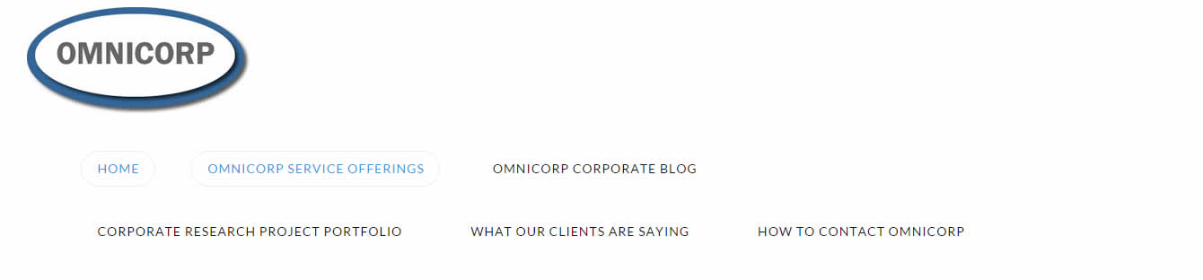 Especially with the emphasis search engines place on link text, it may be tempting to cram as many keywords into your main nav menu as possible, but this is almost always a bad idea. First, it’s a terrible design experience for your human visitors, and second, your keyword strategy should be too complex to execute in a series of navigation menu links. In other words, what you can achieve in a few navigation links will pale in comparison to semantically meaningful page content, with strategic, sensible cross-linking to other relevant content. So keep the menus descriptive, but concise.
2. No Calls To Action
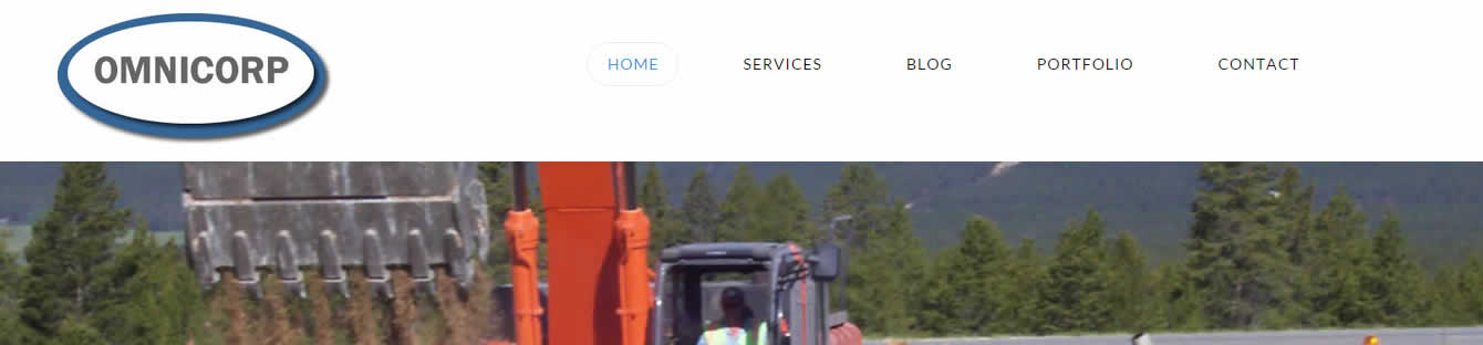 Ultimately, we are trying to get user to click our links, but it’s surprising how often you can still see navigation menus with a benign taxonomy that neither engages the user, nor makes any direct calls to action with the language of the links. This can often be a very minor set of modifications. “About” becomes “Learn About Us”. “Contact” becomes “Contact Omnicorp” or “Contact Us”. This slight tweak plays on human psychology. We all tend to follow instructions, and if we’ve granted authority to a website and it’s content, when it calls for our action, we are likely to comply.
3. Menu Not Responsive
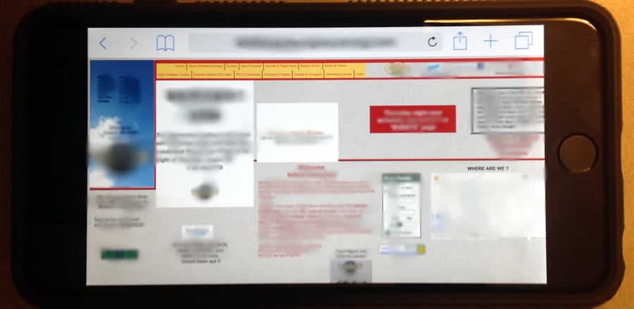 This one plays with the first problem we highlighted to create unsightly, or worse, unusable navigation when your users are coming to your site on a tablet or smart phone. Bottom line: in 2015, your website needs to account for different types of devices, and elegantly display your navigation menu in the best way for the given device. To avoid shaming any particular website, the identifying marks were blurred out of this phone image. But note that we did not have to blur out the navigation menu items. They are too small to use anyway. Make sure your users aren’t having a similar issue with your site! Tens of millions of users prefer their phones and tablets to traditional PC web browsing, so the time is now to address this issue.
4. Too Many Links
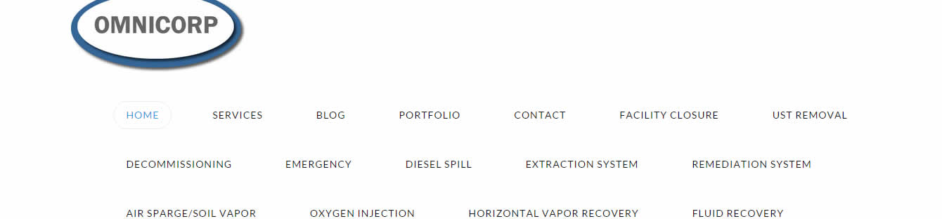 Let’s be clear here: we’re not saying to avoid complicated navigation menus altogether – some website have a very complicated, deep structure – but too many websites try jamming too many top-level items into one menu, limiting the usefulness of organizing links in any way at all. If your website has more then 6 key destinations for users, you may consider having more than one website! This is only partly sarcastic. Even a complicated website like Facebook breaks things down into consumable top-level concepts for users. Usability studies suggest we respond best to 6 or fewer top-level menu items.
5. Too Clever
 I used to think there was no such thing as too clever! But when it comes to web design, tendencies to artistry must necessarily be curtailed in the name of being usable by the maximum number of users. While a 3 word menu that is a sentence may be an interesting way to create a puzzle for certain users, you are sure to turn off and turn away many more users who aren’t looking for a puzzle. If you are trying to sell something online, you better have a “Shop” link. If you have a portfolio of your work, you better have a “Portfolio” or similar link. Leave the artistry for the content itself, and keep your navigation taxonomy clear for users.
6. Not Sticky
 By sticky, we are simply talking about the ability to keep the navigation menu persisting at the top of the page, regardless of where, on the scroll-able page you might be located. Ten years ago, the rule was to avoid creating any content “below the fold” so many of us never worried about sticky menus when scrolling down a page. These days, however, with touch-screen browsing creating a good experience for a more scrolling content interface, most modern site designs include required scrolling to get to critical content. Because of this, a sticky menu becomes much more import; always anchoring your user with their primary means of getting around the main sections of your site in the place they’d normally expect to look: the top of the page. If you want to get even fancier, use a semi-transparent background for your menu, to make sure it’s always clear to a user that they may not really be looking at the “top” of the page, even though their menu is visible.
 Hopefully you can isolate any mis-steps you are taking with your menu designs and mitigate them with a bit of rework. Your clients, and their site visitors will be grateful for your design foresight.
Bill lives and plays in Fort Collins, Colorado. After a fulfilling career for a Fortune 50 company, Bill founded Colorado Web Design in 2012 with a passion for creative digital solutions for business. Bill likes to manage a wide variety of projects and tasks for his clients in the digital space. The creative elements of website design, application design, and marketing are enough to keep anyone busy and engaged, but wiping the slate clean over and over at the start of new projects comes with its own challenges. "I like to start with really good client communication sessions. The rest is easy if you get started in the right way." He plays tennis, bikes, and hikes and then undoes all of that with too much delicious food and TV watching.
About Colorado Web Design
We've been building websites for Colorado businesses since 2002. We are a small team of dedicated individuals who love the challenge of each new marketing project. We live and play in northern Colorado.


More from our blog
See all posts


